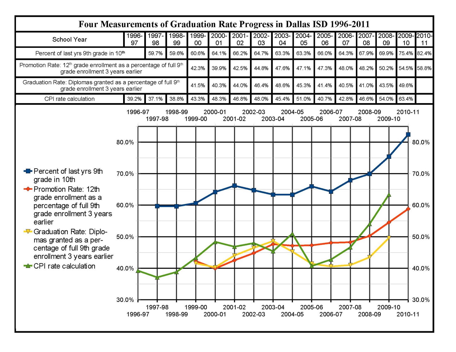
Understanding the true graduation rate in Dallas ISD is critical to understanding what is happening to Dallas children. The first draft of the graph below was produced over a year ago to help clarify the issues relating to graduation rates. It tracks four critical measurements related to graduation rates within DISD. Now, with this 2011 version, each measurement is updated with one more year of data. The ongoing progress by DISD is shown in this graph. Each measurement improved a minimum of 4.3 percentage points to as much as 9.4 percentage points!
These are the four measurements used in this chart:
- The percent of the previous year's 9th grade enrollment reflected in this year's 10th grade enrollment is a way to track the notorious "9th grade bulge." This "bulge" is an inflation of 9th grade enrollment caused by students who are "stuck" in the 9th grade, repeating it until many of them simply drop out. This bulge goes down as a greater percentage of each 9th grade's enrollment moves to the 10th grade. The shrinking of this bulge is a predictor for higher graduation rates. In the past the majority of students who dropped out of DISD were those students who also never made it to even enroll in the 10th grade. That is now changing with the largest 10th grade enrollments in history happening in 2010-2011!
- The promotion rate is a measurement of the percentage of students who successfully make the first three transitions in high school: going from 9th to 10th, 10th to 11th, and 11th to 12th. It is a measurement used in many national studies, such as the John Hopkins University "Dropout Factory" study. It is used due to the difficulty of securing consistent graduation information from each high school across the nation. The 2007 John Hopkins University study declared all 21 non-magnet high schools in Dallas as part of the 2000 schools in the U.S. to be "Dropout Factories" with promotion rates of 60% or below from 2004 to 2006. Now 1/3 of these DISD schools are no longer "Dropout Factories." More progress is anticipated due to the current 70+% reduction of the "9th grade bulge." That reduction improves the potential that more students will be making it to 12th grade and on to graduation.
- The graduation rate used in the chart is the percentage of full 9th grade enrollment reflected in enrollments for each of the three transitions mentioned above, plus the number of diplomas represented in the final transition from 12th grade to actual graduation. Please note that this graduation rate percentage has been growing more rapidly than the promotion rate since 2007. That indicates that more students are passing the relatively recent hurdles presented in the final year of school with more rigorous state testing since 2004. This is very positive progress!
- The CPI rate calculation is the Cumulative Promotion Index used in academic circles as a more timely measurement of the progress being made in a school system. It takes the four transitions of the graduation rate described in number three above and compresses them into one 12 month time frame involving four different student groups. For the Class of 2010 the CPI was made up of the percentage of freshmen failing to transition that year (2009-2010) to be sophomores the next school year (2010-2011), the percentage of sophomores who failed to transition that year to be juniors the next year, the percentage of juniors who failed to transition that year to be seniors the next year, and finally the percentage of seniors who failed to graduate with the Class of 2010. That sum, subtracted from 100%, is the CPI. The CPI is a more predictive measurement because it measures the percentages of students-yet-to-graduate who have already successfully managed three of the four transitions counted in a graduation rate. If a CPI measurement is going down it is a warning signal as well for worse dropout rates to come. In this case DISD has reason to celebrate as the CPI is going up! We must then keep working for an ever higher graduation rate.
If anyone wants copies of the spreadsheets and data sources used to create this chart, please email bbetzen@aol.com.
Critical readings of the data are welcome! All data comes from publicly available sources, mostly TEA. The only data no longer easy to locate online are the enrollment by grade counts for DISD schools as of 11-05-10. These were used as the source for current enrollment numbers for the 2010-2011 school year. They are probably the most error prone of any numbers used to create this chart. They are still probably well over 99% accurate as a projection of the "official" enrollment counts that should appear on the TEA web site within the next 4 months.